Introduction
A dashboard should help a specific user understand what is happening, decide what deserves attention, and investigate the cause. Useful dashboards begin with decisions and reliable definitions rather than with a collection of available charts.
Quick answer
Design a useful business dashboard by identifying its users, decisions, responsibilities, and follow-up actions before selecting metrics or charts. Use consistently defined KPIs, show the relevant time and comparison context, separate overview from investigation, disclose data freshness, and make exceptions visible. Remove vanity metrics that do not change a decision or workflow.
Start with the decision and responsible user
Define what the user should decide or do after viewing the dashboard. A finance lead may need to investigate overdue payments, an operations manager may need to rebalance workload, and a product manager may need to understand where users stop a workflow. Each decision requires different data, context, timing, and level of detail.
Identify who owns the decision, how often it occurs, what authority the user has, and where they go next. A dashboard for executives may summarize direction and exceptions, while an operational dashboard must support immediate investigation. Trying to serve every audience on one screen usually produces crowded metrics with unclear priority.
- The dashboard has a named audience and a defined responsibility.
- Each prominent metric supports a decision, question, or operational action.
- The required update frequency matches how quickly the user can respond.
- Users can move from an exception to the records or workflow behind it.
Define meaningful KPIs and shared metric rules
A KPI needs a documented definition: source data, calculation, time zone, inclusion rules, exclusions, owner, and update schedule. Labels such as active customer, revenue, completed order, or resolved case can mean different things across teams. If the definition is not shared, the dashboard creates arguments about numbers instead of supporting decisions.
Choose metrics that connect activity to outcomes and can influence action. A total count may provide context, but rates, changes, age, distribution, and exceptions often explain more. Avoid vanity metrics that increase without indicating product health or business progress. A smaller set of trusted measures is more useful than a large set of loosely related numbers.
Practical example
Turn a support total into an operational decision
A total number of open requests says little by itself. Break it into age ranges, priority, owner, product area, and change over time. Highlight requests approaching an internal response threshold and link to the affected records. The dashboard now shows where action is needed instead of only describing workload size.
Separate overview from investigation
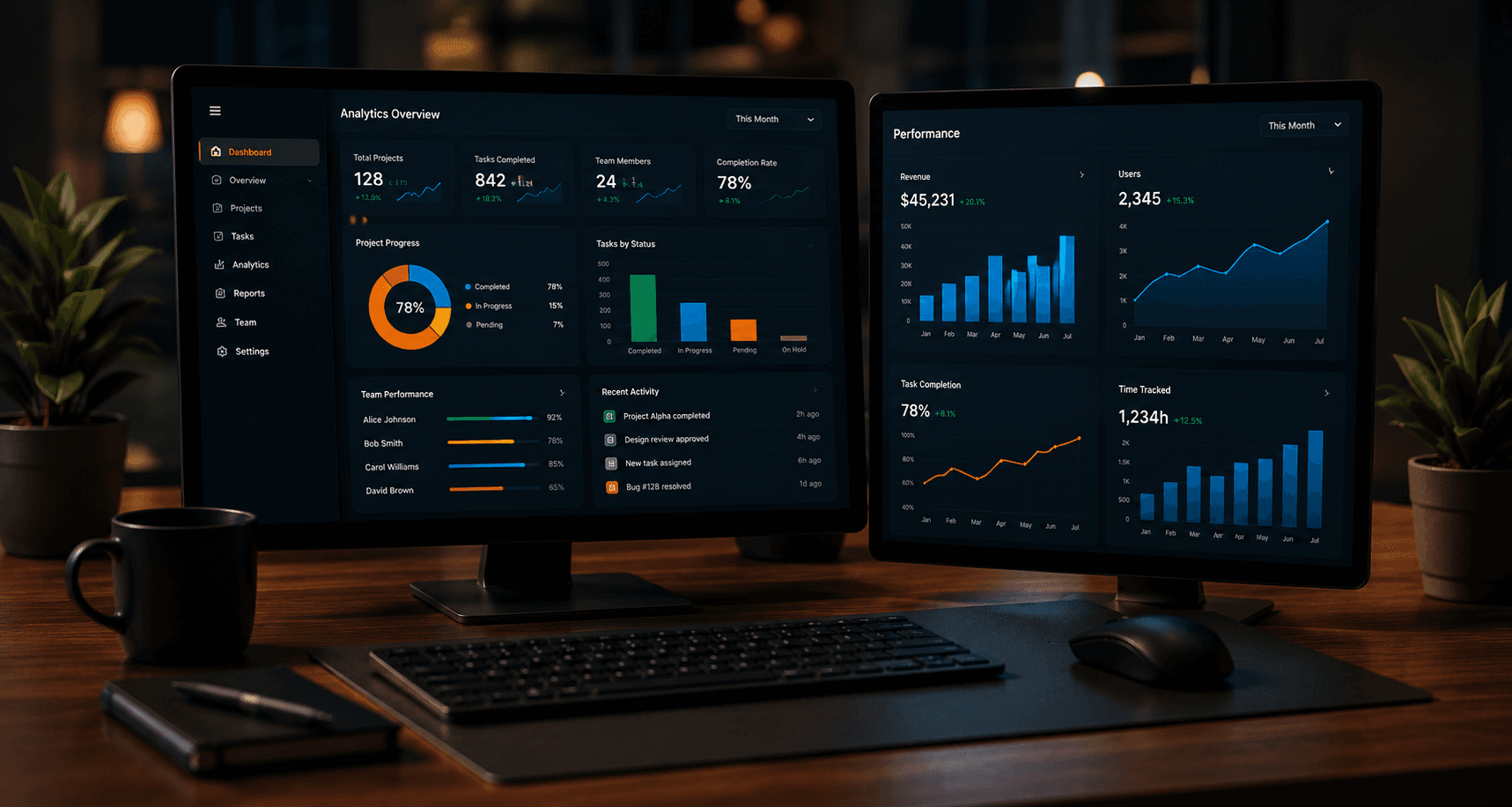
The overview should establish current state, meaningful change, and the few exceptions that need attention. Use hierarchy to place the most important decisions first. Supporting trends and categories can follow, while detailed records belong in a table or linked view where users can search, filter, and act without overwhelming the summary.
Design a path from signal to explanation. A user who sees declining conversion may need a breakdown by channel, product, region, or workflow step. Progressive disclosure keeps the initial screen readable while allowing deeper analysis. Preserve active filters and context when users move between summary and detail.
Related resources
Choose visualizations, filters, and comparisons deliberately
Match the visualization to the question. Use a line for change over time, bars for comparing categories, a table for precise records, and a simple value when one number is the message. Avoid decorative complexity, excessive colors, and charts that make small differences appear dramatic. Labels and units should make the chart understandable without guessing.
Filters should reflect real analysis dimensions and clearly show their active state. Time periods need consistent boundaries and useful comparisons, such as the preceding period or a relevant target. Explain when metrics cannot be compared directly because definitions, coverage, or data availability changed.
- Every chart has a clear question, label, unit, and time context.
- Color communicates status or grouping consistently and remains accessible.
- Default filters answer the most common decision without extra setup.
- Comparisons use equivalent definitions and periods.
- Tables support scanning, sorting, filtering, and access to underlying records.
Make data quality, freshness, and interface states visible
Show when data was last updated and whether all expected sources are available. Real-time display is unnecessary when the business acts daily, while an operational alert may need faster updates. Align freshness with the decision and disclose delays so users do not interpret an incomplete period as a real change.
Design empty, loading, partial, and error states. No results may mean that filters are too narrow, the workflow has no records, or data failed to load; those situations need different messages. Metric definitions and source ownership should be accessible so users can understand and report questionable values.
Plan alerts, exceptions, and dashboard delivery
Alerts should identify conditions that require timely attention, not repeat every change visible on the dashboard. Define the responsible role, threshold or rule, delivery channel, deduplication, and resolution path. Users should be able to understand why an alert fired and reach the relevant records without searching through several systems.
Before development, review the dashboard plan with users and data owners. Confirm that each required field exists, definitions agree, permissions protect sensitive breakdowns, and the team can maintain the data pipeline. Release a focused first view, observe how people use it, and improve navigation or metrics based on actual decisions.
- 1Name the dashboard audience, decisions, responsibilities, and follow-up actions.
- 2Define each KPI, source, owner, calculation, update schedule, and access rule.
- 3Prioritize overview signals and map the path into detailed investigation.
- 4Choose visualizations, filters, periods, and comparisons for specific questions.
- 5Design freshness, empty, loading, partial, error, and permission states.
- 6Validate with realistic tasks, then measure usage and refine the released dashboard.
Related resources
Key Takeaways
- Design dashboards around a user, decision, and follow-up action.
- Document KPI definitions, sources, ownership, and freshness.
- Separate a clear overview from deeper investigation and records.
- Use charts, filters, and comparisons only when they answer a real question.
- Make exceptions and data-quality states visible and actionable.