Introduction
Good design is not only about appearance. It gives product and development teams an agreed model of users, workflows, interface states, and reusable behavior before those decisions become expensive code.
Quick answer
Good UI/UX design saves development time by resolving requirements, user flows, component behavior, content hierarchy, and edge states before implementation. Wireframes expose structural problems early, prototypes validate important interactions, and reusable design patterns reduce inconsistent one-off code. A clear handoff lets developers build known behavior instead of repeatedly interpreting incomplete screens.
Clarify requirements before coding
Unclear requirements force developers to make product decisions while implementing. A screen may look simple but still leave unanswered questions about who can use it, where the data comes from, which actions are reversible, and what happens after success or failure. Those gaps create inconsistent behavior and repeated revisions across design, frontend, backend, and testing.
UI/UX work turns vague feature requests into observable behavior. A designer can connect business rules to user tasks, identify missing information, and make alternatives visible to stakeholders. Resolving a flow in a wireframe is faster than changing several components, APIs, tests, and database assumptions after a feature has already been built.
Related resources
Design user flows before individual screens
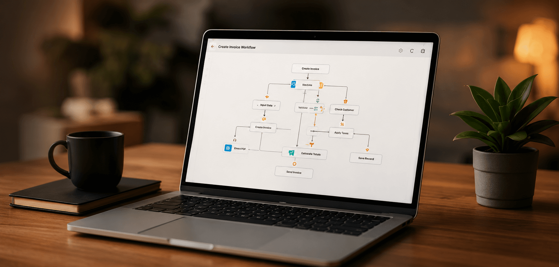
Start with the user's goal and the sequence required to reach it. Map entry points, choices, required information, permission checks, confirmations, and recovery paths. This reveals whether the product asks for information too early, creates unnecessary steps, or leaves a user stranded after an error.
A flow should include different roles and realistic transitions, not only the ideal path. Consider an invited user who has not completed setup, an administrator reviewing a request, or a returning user with partially completed work. When the flow is agreed first, each screen has a clear purpose and developers can understand how state moves through the system.
- 1Name the user, their goal, and the event that starts the workflow.
- 2List the decisions, required data, permissions, and external dependencies.
- 3Map the successful path from entry to a clear completed outcome.
- 4Add cancellation, validation, permission, timeout, and recovery paths.
- 5Review the flow with product, design, engineering, and operational owners.
Use wireframes and high-fidelity design for different decisions
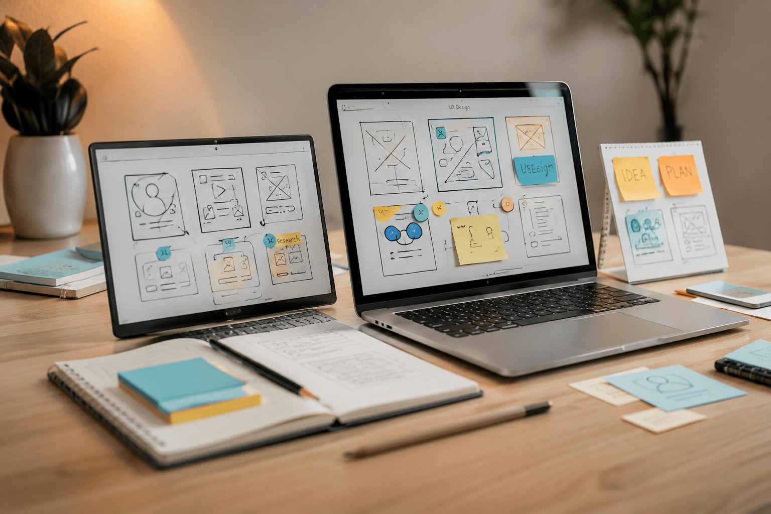
Wireframes are best for structure, hierarchy, content needs, and navigation. Their limited visual detail keeps attention on whether the workflow makes sense. They are useful while requirements are still changing because screens can be rearranged without implying that colors, spacing, and visual polish are already approved.
High-fidelity designs answer implementation questions about typography, responsive layout, component variants, interaction feedback, and brand treatment. Move to this level after the important flows are stable. Polishing a weak workflow can make it look finished while hiding unresolved product decisions that will still cause rework later.
Practical example
Resolve an approval flow before polishing the dashboard
For an expense approval feature, first wireframe submission, validation, manager review, rejection with comments, revision, and final approval. Once roles and transitions are correct, high-fidelity design can define tables, status badges, forms, dialogs, and responsive behavior. This sequence prevents visual work from being discarded when the approval rules change.
Design reusable components and complete interface states
A design system gives repeated interface decisions one consistent answer. Buttons, inputs, tables, navigation, cards, dialogs, badges, and alerts should have defined variants and usage rules. Developers can reuse tested components instead of recreating slightly different behavior for every feature, which improves speed and reduces visual and accessibility defects.
Design the states around the component, not only its populated default. Empty, loading, error, validation, disabled, success, and permission-restricted states affect real workflows. Responsive behavior, long text, missing images, and large data sets also need direction. When these states are absent, implementation stops for clarification or proceeds with assumptions that later require correction.
- Empty states explain what is missing and the next available action.
- Loading states match the expected duration and prevent duplicate actions.
- Validation identifies the field, problem, and path to correction.
- Errors preserve useful input and provide a safe recovery option.
- Permission states distinguish unavailable actions from system failures.
- Components define keyboard, focus, responsive, and content-overflow behavior.
Create a development-ready handoff
A useful handoff explains behavior, not only dimensions. Connect screens into flows, identify reusable components, document variants, and annotate rules that cannot be understood from a static image. Include realistic content and data shapes so developers can see how the design responds to long labels, optional values, permissions, and different record states.
Design and engineering should review the work together before implementation. Developers can identify expensive interactions, data dependencies, or platform constraints, while designers can clarify the intended hierarchy and behavior. This conversation often produces a simpler solution that keeps the user outcome while reducing custom code and uncertainty.
Review usability before development starts
Walk through the prototype with representative tasks rather than asking whether the screens look good. Ask users to explain what they expect, find information, complete the workflow, and recover from a mistake. Observe hesitation and incorrect assumptions. The purpose is to reveal problems in labels, hierarchy, navigation, and flow before implementation hardens them.
Common time-consuming mistakes include designing isolated happy-path screens, using inconsistent components, hiding critical actions, depending on placeholder content, and leaving responsive behavior undefined. A short readiness review creates a shared checklist and makes unresolved decisions explicit instead of transferring them silently to development.
- Primary user flows are complete from entry through success and recovery.
- Wireframes have validated structure before visual polish begins.
- Components and variants are reusable across the planned features.
- Empty, loading, error, validation, permission, and success states exist.
- Responsive layouts and realistic content extremes have been reviewed.
- Interaction rules, data dependencies, and unresolved questions are documented.
- Product, design, and engineering agree that the work is ready to build.
Related resources
Key Takeaways
- Use flows to resolve behavior before designing isolated screens.
- Choose design fidelity based on the decision being made.
- Define reusable components and every important interface state.
- Treat handoff as a design-and-engineering review, not a file delivery.
- Test realistic tasks before coding to find avoidable rework early.